Field trip: Unité d'Habitation, Marseille
Guest starring Provence-by-way-of-LA photographer Laure Joliet
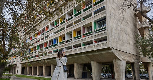
In this issue, I have a very special guest: Laure Joliet, who is sharing the photographs she took earlier this fall on our friend date to the Unité d’Habitation in Marseille, designed by Le Corbusier and completed in 1952. The building embodies a post-war housing concept by Corbu called Cité Radieuse which is a vertical city, in which the daily needs (shelter, exercise, commerce, education, BEAUTY) is addressed within one piece of architecture. Three subsequent Unités were constructed around France—plus one in Berlin—but this edifice, with its 330 apartments, 23 apartment types, built on three principal modules, was the blueprint. The kitchen units and storage walls were designed by Charlotte Perriand; steel stairs and metal counters on the interior were fabricated by Jean Prouvé.
We happened to visit on Le Corbusier’s birthday, and while we witnessed no architect ghost jumping out of a birthday cake, we receive a pretty clear signal on what this place was all about. I, for one, had just come from Paris where I’d scoped the earliest houses designed by Le Corbusier: Maisons La Roche et Jeanneret (1923) and Maison-atelier Ozenfant (1924). Extremely purist in both form and thesis, Maison La Roche defines his oft-quoted manifesto on the five necessary elements for new architecture: pilots, free plan for the ground floor, free plan for the facade, horizontal windows, and a rooftop garden. The buildings from this period are beautiful in their austerity and sort of situate themselves within their (sub)urban context.
Le Corbusier working twenty years later employs the same principles but to a different effect. Unité is also imposing, but it’s through his use of béton brut concrete, which allows the structure’s monumental, vertically-oriented scale. That scale is all the more noticeable in its location outside of the city’s center. The brief here was obviously quite different than a private residence (the city of Marseille commissioning large housing projects to accommodate displaced persons after WWII) and his approach is mellower, rigid but generous, and almost playful in parts. The plan is Corbusian rigorous, but through the interplay of dark and light, color and material, he has taken liberties with his own grand thesis. (On color: note the “wicked green” throughout.) Nowhere is this more evident than on the rooftop, which houses fanciful sculptures (to house a ventilation stack), an elevated kindergarten classroom over a shallow pool, a gym and running track, an open-air theater platform, and rock formations around the perimeter that converse with the surrounding landscape.
To accompany the images shown here—exclusive to Ground Condition, évidemment—I asked Laure to weigh in from a photographer’s perspective:
“It’s always a little intimidating to show up to an iconic building that has been well documented by photographers prior and expect to reinvent the wheel. But the way I ended up capturing Le Corbusier’s original Cité Radieuse, in Marseille, is one of my favorite approaches to ‘Big Architecture'. As in, totally on the fly: no scouting, just discovery and photography simultaneously.
This was in the beginning of October, and the weather was abnormally gloomy. It had started to drizzle, and we were trying to be discreet*—so, no tripod, no time for heady overthinking, just giddily following Kelsey around and quickly stealing the moments that were unfolding in front of us. I was also keeping an eye on Kelsey because I wanted to make sure I was capturing how she looked at the building. Plus, it helps to have a person for scale, to soften the lines and the seriousness of the dramatic materials and weather.
On approach, it felt radical to experience the scale from a distance! As my son would say, SO BIG. I wanted to pull over right there, but urgency to see it up close propelled us. Once parked, we approached on foot and my first thought was, How to even get the building in a frame? It’s all shooting straight up, it makes no sense. So I tried to capture that feeling by photographing Kelsey standing on the highest thing she could find** to try to get her own shot, and being absolutely dwarfed by this massive structure.
Once inside, we went straight to the roof. I was looking for how the building played with the landscape, how the roof was, essentially, a landscape. I focused on defining angles and symmetry since there was no sunshine, no big highlights or shadows to guide compositions. So I went with embracing the neutral palette with color accents, and all the textures, while making sure to shoot wide enough to show scale but still feel intimate.
Inside, it was striking how dark the inner corridors for residents were. So dark that without a flash or a tripod I really couldn’t get a shot I wanted to share. What a decision by Le Corbusier. To keep the inside so dark so that every time an apartment door opens, it is a revelation, a wash of light and height (the apartments are all double height). Every time you come home, you are reborn into the light.
Being there and getting to begin to understand the functionality of how Le Corbusier wanted to define the rhythms of life was pretty wild. What an idea! What execution! And to see firsthand how people move through and live in the building was the most striking. It is not a historic museum site, preserved in time. This is a living, dynamic space. Perhaps nothing personified it more than the little old lady in red returning from her errands and shuffling below us on her way home. She was as true and real a part of Le Corbusier's vision as any angle or window or staircase.”
*It’s technically a private residential building that happens to have one floor of hotel rooms, with a restaurant, and two floors designed as “shopping streets.” There’s a nursery school on the roof, which is supposed to be absolutely forbidden to architectural lookie-loos, but… when in Marseille.
**One of the extant, Borne Béton Grande concrete light fixtures around the grounds of the building. Nemo Lighting re-issued the original design in 2016 and you can purchase it, if so inclined.
Odds and ends
My friends Yasmin Vobis and Aaron Forrest of Ultramoderne worked with engineer Brett Schneider on what might be my favorite architecture book of recent vintage: Heterogeneous Construction, a study of and case for mixing materials. The technical drawings are unbelievable (extremely precise, in neon ink… if you’ve ever been on press to print anything, you know how difficult that is) and the concept is catnip for material maximalists not unlike myself. Available through the publisher and, curiously, five copies here.
Casa Veronica is a ceramics-focused design studio based in Texas, run by Chicana Indígena Verónica Ortuño. She introduced the aptly named Mágico Lamp this fall in three delectable material options: chrome, glossy earthenware, and “Morel,” which has a raw sand finish. Brand-new to the site is the holiday collection—chockablock with great tile, vessels, and a set of egg cups (ahem).
If you missed the last issue—on how to share a love of collecting as a lifelong gift—consider upgrading your subscription to get behind that paywall! And for those who have already ponied up, congratulations, you have great taste.
In all seriousness, though, thank you for reading and subscribing.
Until next time,
Kelsey
Coming up on Ground Condition, because this email got too long: my long-promised architecture itinerary from France, real versus knockoff lighting, cladding studies, and more.
Amazing
Fellow concrete ogler here and also green door and red handrail ogler, too...